TIMELINE
TEAM
MiFi portable router provides instant, home-like internet access through cellular networks — designed for users who expect reliable connectivity without the complexity of a traditional router setup. The challenge was to translate real telecom and hardware constraints into an experience that felt simple from the first unboxing.
MiFi devices are technically complex, yet primarily used by non-technical users. From a business perspective, first-time success and low support costs were critical. The challenge was to transform a router-like device into a reassuring home-internet experience.

The experience had to balance:
Hardware constraints
Firmware limitations
Network dependencies
Business requirements
The design brief was essentially: make all of this invisible to the user.

Led the definition of the end-to-end product experience
Established UX principles across device and interface
Designed onboarding and core interaction flows
Acted as a decision bridge between product, engineering, and industrial design

Delivered end-to-end — from concept to deployment — in 4 months, leading a cross-continental team of 5 across Paris and China (Design, PM, Engineering and Developer).
The white-label architecture was designed to scale from day one, enabling deployment across European markets without redesign. The UX principles established on MiFi became the foundation for subsequent CPE product lines, directly contributing to the company's ability to expand its hardware portfolio and attract new operator clients.
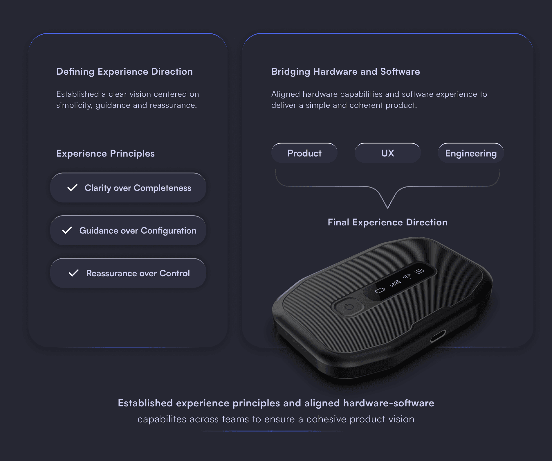
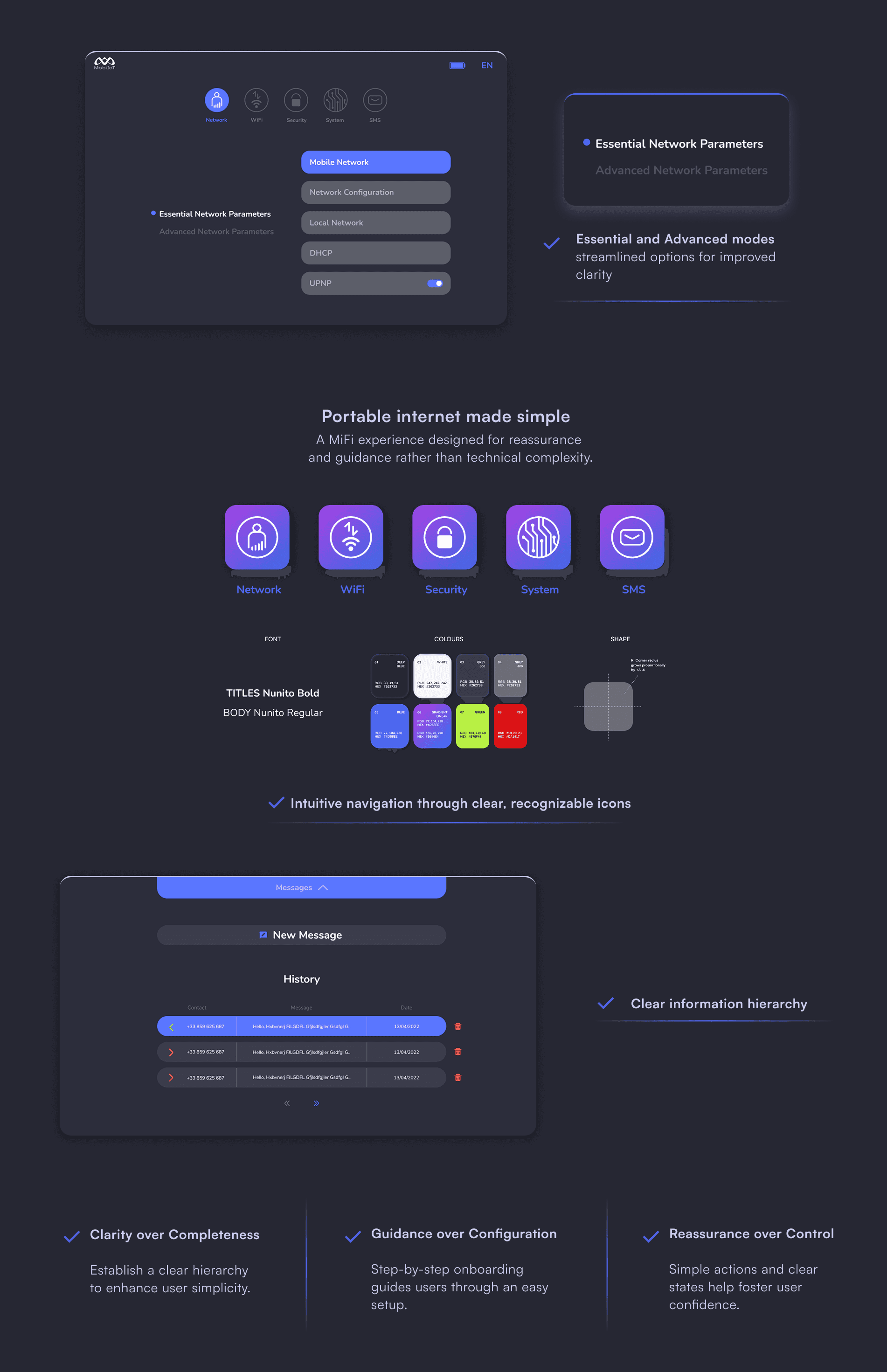
MiFi was positioned not as a technical router, but as “home internet made simple.”This required reframing the product from a device with features to an experience centered on reassurance.
Clarity over completeness
We avoided exposing all available technical settings.
Guidance over configuration
The onboarding guided users step-by-step instead of requiring setup knowledge.
Reassurance over control
Clear confirmation states were prioritized over advanced customization.
In practice, this meant translating firmware behavior into UX decisions in real time — not waiting for engineering to flag a problem, but being present enough in technical conversations to catch constraints before they became user-facing issues.

The experience extended beyond the interface:
Unboxing
Physical interaction with the device
Status communication
Daily usage scenarios
Design decisions were made across physical and digital touchpoints. The interface was one layer of that system — not the whole thing.

Owning the product experience meant being the person who held the full picture when everyone else was focused on their own piece — hardware, firmware, business requirements, operator needs.
Leadership meant:
Defining experience direction early
Maintaining clarity under constraints
Acting as a decision anchor across teams