let's connect

dominikahaas@gmail.com

Email copied!

let's connect

dominikahaas@gmail.com

Email copied!

let's connect

dominikahaas@gmail.com

Email copied!

Le Boncoin

Le Boncoin

Website Revamp & Feature Integration

Website Revamp & Feature Integration

This project was part of a digital product design formation focused on user experience strategy, research, and feature innovation. The challenge was to rethink the existing Leboncoin website, identifying usability issues and proposing a new feature that could improve user engagement and platform visibility. Our team aimed to combine research-based insights with modern interface design principles, resulting in a clear, cohesive, and engaging digital experience.

ROLE

ROLE

UX/UI Designer

UX/UI Designer

FOCUS

FOCUS

Conducted user research, refined the design system, and designed key interfaces, contributing to storytelling, style guide, and front-end integration

Conducted user research, refined the design system, and designed key interfaces, contributing to storytelling, style guide, and front-end integration

Conducted user research, refined the design system, and designed key interfaces, contributing to storytelling, style guide, and front-end integration

timeline

3 months (2023)

3 months (2023)

3 months (2023)

TEAM

4 UX UI Designers & 2 DWFS

4 UX UI Designers & 2 DWFS

4 UX UI Designers & 2 DWFS

CONTEXTE

CONTEXTE

Leboncoin is one of France’s most visited platforms for buying, selling, and exchanging goods and services.
However, its long-standing interface had become visually inconsistent and functionally outdated, leading to user frustration and decreased engagement.


The goal was to modernise the interface, simplify navigation, and introduce a new feature that would bring freshness and added value to the overall user experience. We also defined a clear project timeline to better coordinate across teams and structure each step, ensuring smoother collaboration and efficient delivery.

DISCOVER

DISCOVER

We started by studying the role of Leboncoin in users’ daily lives, analysing its target audience and positioning.
To better understand user needs, we conducted field interviews in the streets of Paris, observing and questioning people about their habits and motivations when using the platform.


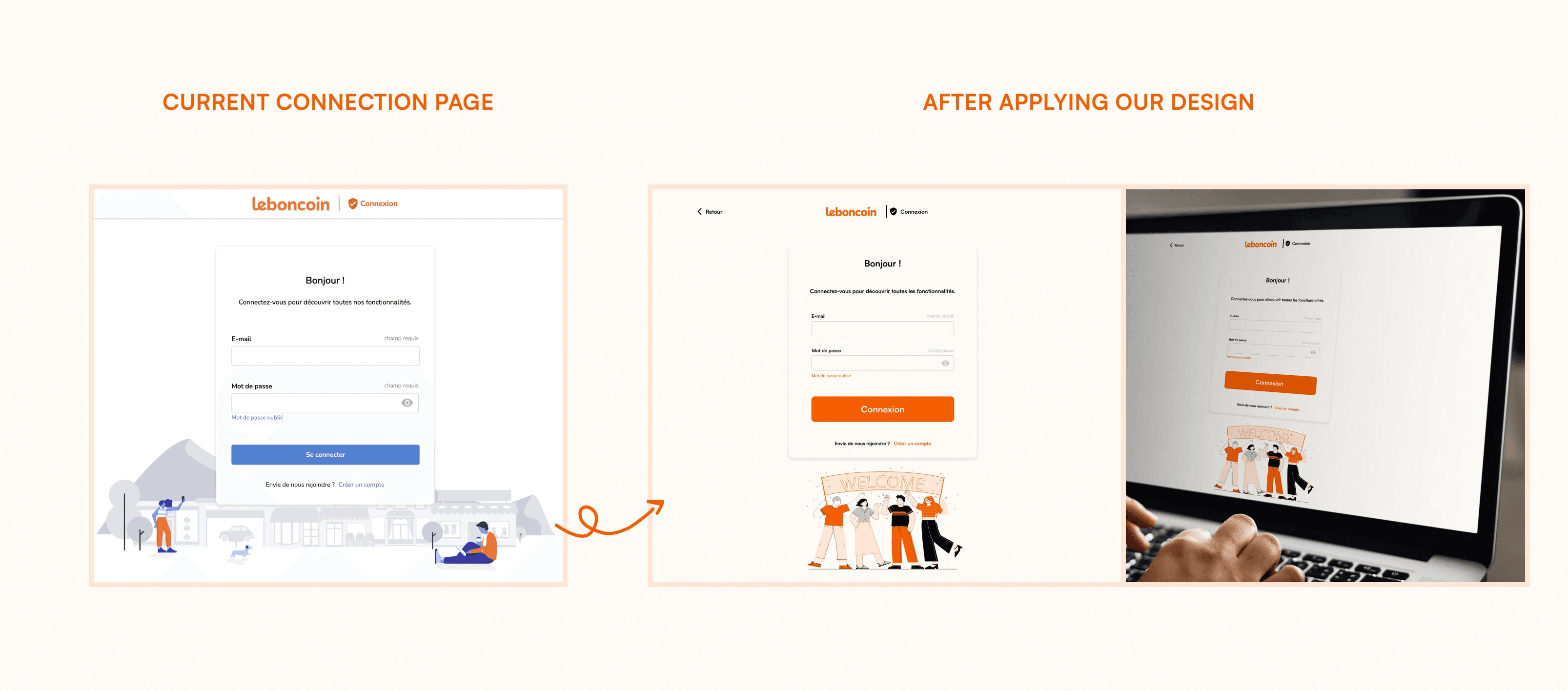
We also performed a UX audit of the current website, identifying structural and visual pain points:

  • Overuse of buttons, colours, and icons without harmony

  • Cluttered navigation bar, reducing clarity

  • Poor colour contrast and limited white space

  • Visual noise that discouraged users from exploring further


This step allowed us to clearly define which elements of the user experience required improvement.

DEFINE

DEFINE

Following the audit and user research, we defined our problem statement:

“How can we refresh the Leboncoin experience to make it more intuitive, visually coherent, and attractive to a wider audience?”


Our goals were:

  • Improve navigation clarity and site hierarchy

  • Modernise the interface with a simplified visual system

  • Create a new feature to increase engagement and encourage repeated use

  • Ensure that the redesign remains consistent with Leboncoin’s trusted brand identity

IDEATE

IDEATE

We explored several directions for potential new features, guided by user expectations and market trends.
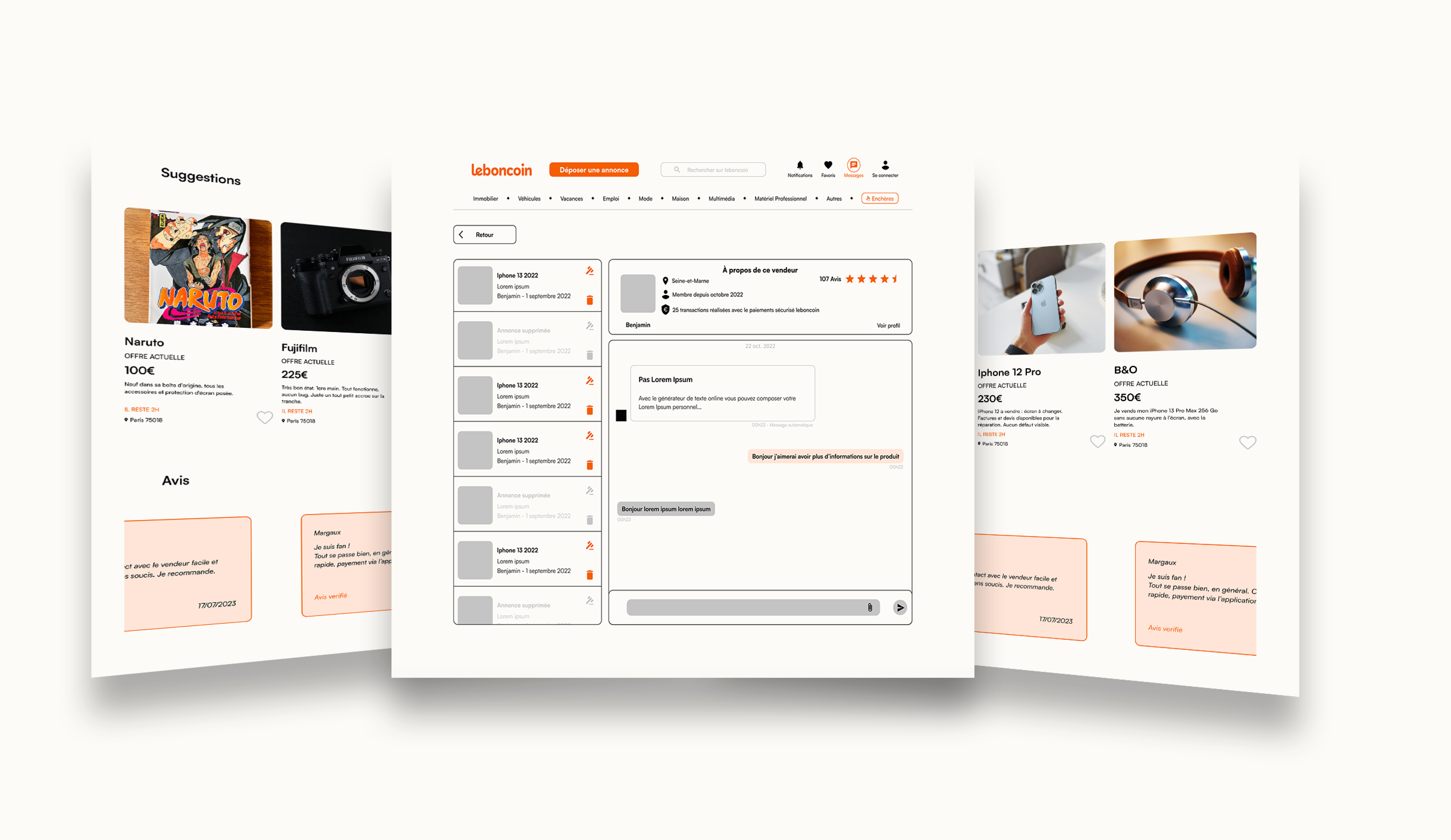
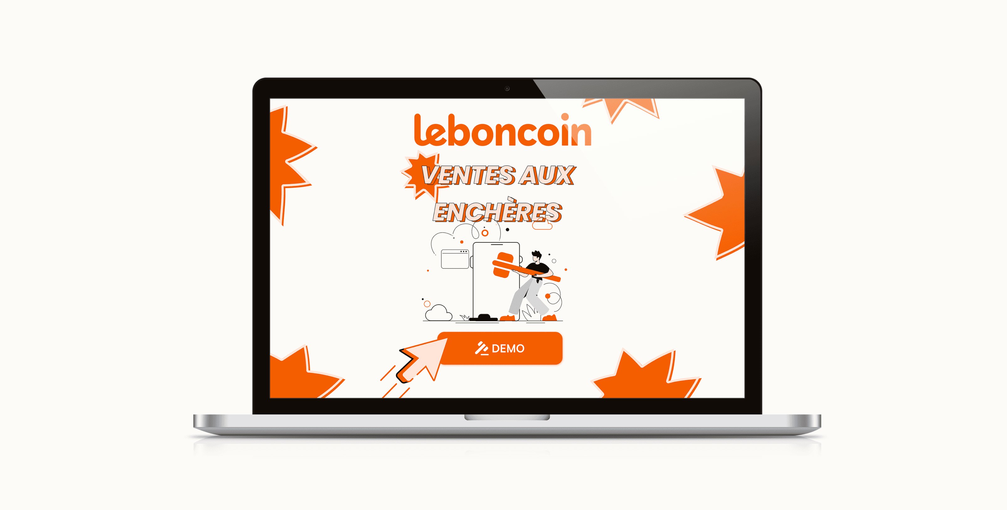
After multiple brainstorming sessions, we decided to integrate an Online Auction feature — a concept aligned with the platform’s DNA and the rising trend of interactive selling formats.


We then produced low-fidelity wireframes and sketches to test new page structures and interactions.
The focus was on maintaining simplicity while improving hierarchy and legibility.

CONCEPTUALIZE

CONCEPTUALIZE

We redesigned the visual language of the website to make it feel more modern, friendly, and consistent:

  • Reduced colour palette for a harmonious look

  • Simplified icons and typography for better readability

  • Added modern illustrations to convey personality and approachability


Special attention was given to the navigation bar and footer, ensuring they were intuitive, responsive, and aligned with the new design system.

INTEGRATE

INTEGRATE

The redesign was carried out collaboratively with a team of two full-stack developers.
My role focused on:

  • Building and styling the footer and navigation bar in HTML and CSS

  • Ensuring visual consistency and responsiveness across devices

  • Communicating closely with the developers to align the design with technical requirements


This phase highlighted the importance of cross-disciplinary dialogue and iteration between design and development.

man wearing headphones while using computer

DEVLIER

DEVLIER

The final solution presented:

  • A modernised interface with improved readability and structure

  • The Online Auction feature to attract new users and increase engagement

  • A refreshed visual identity that feels both professional and accessible

  • Enhanced harmony between design, usability, and brand personality

PROJECT INSIGHT

PROJECT INSIGHT

This project was a strong exercise in UX research, interface design, and collaborative teamwork.
It taught me how to:

  • Balance aesthetic updates with functional improvement

  • Translate user feedback into actionable design decisions

  • Communicate effectively between design and technical teams

  • Maintain brand authenticity while introducing innovation


Most importantly, it reinforced how human-centered design and team collaboration lead to meaningful, sustainable product improvements.

dominikahaas@gmail.com

Email copied!

Dominika HAAS

Designing 3D & UX/UI experiences that bridge vision and usability — currently shaping projects at MobiWire Group.

© 2025 Dominika Haas. All rights reserved.

dominikahaas@gmail.com

Email copied!

Dominika HAAS

Designing 3D & UX/UI experiences that bridge vision and usability

— currently shaping projects at MobiWire Group.

© 2025 Dominika Haas. All rights reserved.

dominikahaas@gmail.com

Email copied!

Dominika HAAS

Designing 3D & UX/UI experiences that bridge vision and usability

-currently shaping projects at MobiWire Group.

© 2025 Dominika Haas. All rights reserved.