MiFi devices are technically complex, yet primarily used by non-technical users. From a business perspective, first-time success and low support costs were critical.

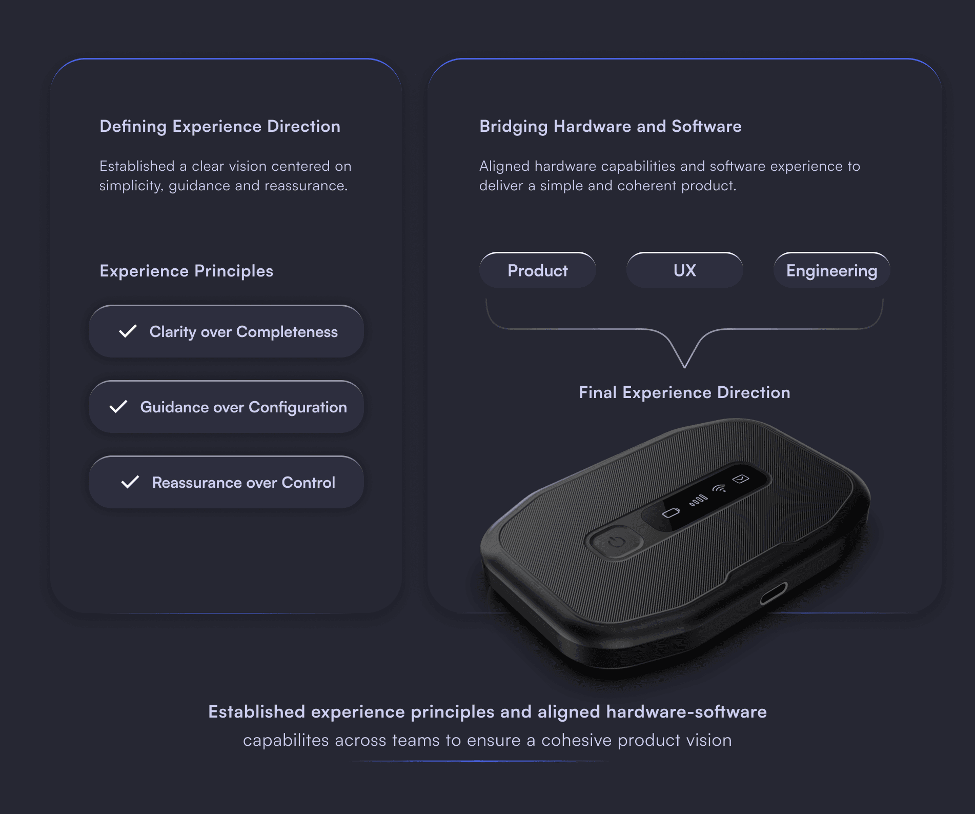
The brief was to make technical complexity invisible — firmware behaviour, network dependencies, hardware limits — without reducing functionality. I held the full product experience: defining UX principles, designing flows, and acting as the decision bridge between product, engineering, and industrial design. That position meant catching constraints before they became user-facing problems.
The platform exposed all technical parameters to all users by default. For non-technical users — the majority — this created confusion and longer task times. I introduced a two-tier model within each section: Essential surfaces what most users ever need; Advanced reveals deeper configuration for operators and technical users. This pattern wasn't standard in the CPE/connectivity space at the time. It became a foundational principle carried into subsequent product lines.

Making Data Feel Human
Usage data existed in the system but arrived as raw numbers. I introduced a visual progress bar showing monthly consumption against the total — so a non-technical user could understand their data situation at a glance without reading a figure. Only the three controls most users actually need — Data, Roaming, Data Threshold — are surfaced at this level. Everything else sits one step deeper.
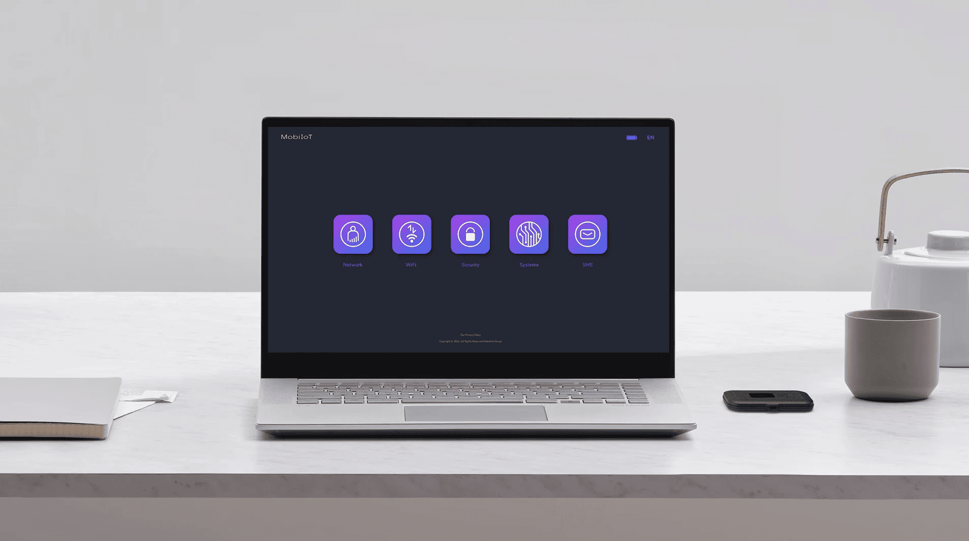
Icon-Driven Navigation
Category navigation uses icons with short labels rather than text-only lists. On a device interface used while standing, often in a hurry — reduced reading load matters. The active state (filled icon, highlighted label) makes current location immediately clear without needing a breadcrumb or page title.

Launched in 5 months as MobiWire’s first browser-based SaaS for router management, with a cross-continental team of 5 and me as the sole designer. Deployed in Europe and Africa; first delivery accepted with no major revisions. The Essential/Advanced pattern has since been reused in all new projects.
Information Architecture
Before any screen was designed, I mapped the full information architecture in collaboration with the PM — defining categories, naming conventions, and content hierarchy across the platform.
Reusable Layout System
Three core layout templates became the structural backbone of the interface — repeated and adapted across all screens to ensure visual coherence and accelerate delivery.
Scale
The final product spans 55 screens, 10 modal overlays, and 3 alert states — designed for deployment across European and African markets. Navigation icons were designed from scratch to ensure visual consistency across all five categories.

In practice, this meant translating firmware behavior into UX decisions in real time — not waiting for engineering to flag a problem, but being present enough in technical conversations to catch constraints before they became user-facing issues.

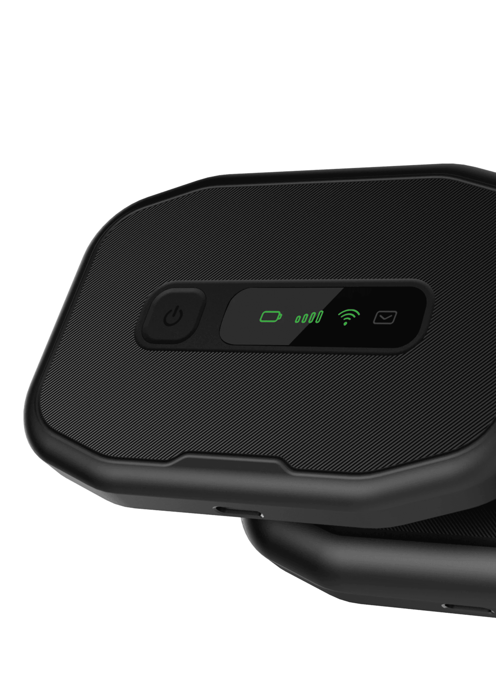
The experience didn't start at the screen. It started at unboxing — the moment someone held the device for the first time. Physical interaction, status communication, daily usage scenarios — design decisions ran across all of it. The interface was one layer of that system, not the whole thing.